Trend of Incidents over time
Bike use and bike and microvehicles crashes over time
On this page, we’ll explore trends of bicycle use and bicycle and motorvehicle crashes over time, from 2017 through the end of October of 2020. This birds-eye-view will let us start to get a sense of whether there were noticeable differences pre and post covid, and of general trends over time.
Bike and microvehicle use and crashes in NYC, 2017-2020
In order to get a sense of bicycle use and bicycle and microvehicle crashes in the context of the covid pandemic in NYC, we start by looking at bicycle and microvehicle crashes and bicycle use over time. The plots below show, from top to bottom: * Daily number of bicycles counted in NYC by the Department of Transportation’s counters from 2017-2020 * Daily number of bicycles involved in crashes in NYC according to NYPD data on motorvehicle collisions from 2017-2020 * Daily number of microvehicles (including scooters, mopeds, electric bikes, e-bikes, and revel scooters) involved in crashes in NYC according to NYPD data on motorvehicle collisions from 2017-2020.
Note that crashes are quantified as the number of bicycles (or microvehicles) involved, rather than the number of crashes - ie, if one crash occured involving two bicycles, that would count as two.
microveh_crash_plot = microvehicle_crash_agg %>%
  ggplot(aes(x = date, y = daily_microveh_crashed)) +
  geom_point(alpha = .3) +
  geom_smooth(se = FALSE) +
  labs(
    title = "Microvehicles involved in crashes in NYC daily: 2017-2020",
    x = "Date",
    y = ""
  )

bike_crash_plot = bike_crash_agg %>%
  ggplot(aes(x = date, y = daily_bikes_crashed)) +
  geom_point(alpha = .3) +
  geom_smooth(se = FALSE) +
  labs(
    title = "Bicycles involved in crashes in NYC daily: 2017-2020",
    x = "Date",
    y = ""
  )

bike_count_plot = bike_count_agg %>%
  ggplot(aes(x = date, y = total_daily_bikes)) +
  geom_point(alpha = .3) +
  geom_smooth(se = FALSE) +
  labs(
    title = "Bicycle use in NYC: Bicycles counted daily by NYC DOT 2017-2020",
    x = "Date",
    y = ""
  )

bike_count_plot / bike_crash_plot / microveh_crash_plot
## `geom_smooth()` using method = 'gam' and formula 'y ~ s(x, bs = "cs")'
## `geom_smooth()` using method = 'gam' and formula 'y ~ s(x, bs = "cs")'
## `geom_smooth()` using method = 'loess' and formula 'y ~ x'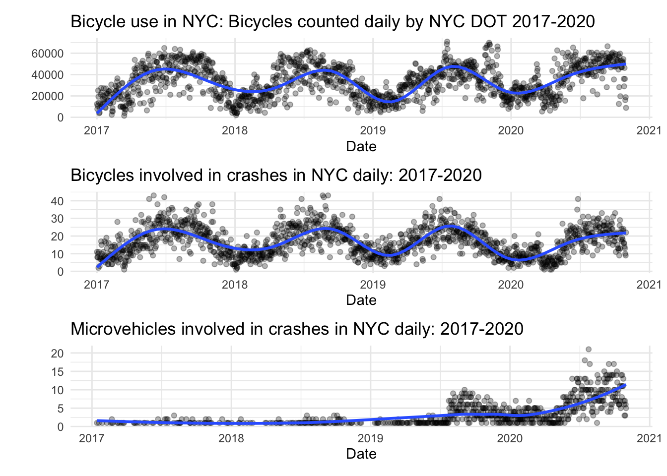
As we can see, there’s a strong seasonal trend for bicycle use and a corresponding seasonal trend for bicycles involved in crashes.
Overlay years
Bike use In order to take a more detailed look at how bicycle use and may have differed during 2020, we’ll overlay each year of daily bicycle counts onto one plot. Click on the years to select/unselect.
bike_count_yr_plot = bike_count_agg %>%
  mutate(year = lubridate::year(date),
         month = lubridate::month(date),
         day_of_month = lubridate::mday(date),
         common_date = lubridate::mdy(paste(month, day_of_month, "2020")),
         year = as.factor(year)) %>%
  ggplot(aes(x = common_date, y = total_daily_bikes,
             group = year, color = year)) +
  geom_point(alpha = .3) +
  geom_smooth(se = FALSE) +
  labs(
    title = "Bicycles counted daily by NYC DOT 2017-2020",
    x = "Month",
    y = "Number of Collisions"
    ) +
  theme(text = element_text(size = 15),
        axis.text.x = element_text(angle = 60, hjust = 1, size = 10)) +
  scale_colour_discrete("Year") +
  scale_x_date(date_breaks = "1 month", labels = function(x) format(x, "%b")) +
  scale_color_viridis_d(end = .8)
## Scale for 'colour' is already present. Adding another scale for 'colour',
## which will replace the existing scale.

ggplotly(bike_count_yr_plot)
## `geom_smooth()` using method = 'loess' and formula 'y ~ x'
## Warning: `group_by_()` is deprecated as of dplyr 0.7.0.
## Please use `group_by()` instead.
## See vignette('programming') for more help
## This warning is displayed once every 8 hours.
## Call `lifecycle::last_warnings()` to see where this warning was generated.
As we can see, 2020 started out with higher bike use than the previous years, dipped slightly, and then surpassed the other years seasonal bike counts starting around July. From this visualizaion, we can’t say definitively if COVID played a role in trends related to bicycle use, but it is interesting to observe how trends in 2020 differed from prior years.
Bike crashes
We can visualize the bike crash data in a similar way.
bike_crash_yr_plot = bike_crash_agg %>%
    mutate(year = lubridate::year(date),
           month = lubridate::month(date),
           day_of_month = lubridate::mday(date),
           common_date = lubridate::mdy(paste(month, day_of_month, "2020")),
           year = as.factor(year)) %>%
  ggplot(aes(x = common_date, y = daily_bikes_crashed,
             group = year, color = year)) +
  geom_point(alpha = .3) +
  geom_smooth(se = FALSE) +
  labs(
    title = "Bicycles involved in crashes daily in NYC 2017-2020",
    x = "Month",
    y = "Bikes involved in crashes"
    ) +
  theme(text = element_text(size = 15),
        axis.text.x = element_text(angle = 60, hjust = 1, size = 10)) +
  scale_colour_discrete("Year") +
  scale_x_date(date_breaks = "1 month", labels = function(x) format(x, "%b")) +
  scale_color_viridis_d(end = .8)
## Scale for 'colour' is already present. Adding another scale for 'colour',
## which will replace the existing scale.

ggplotly(bike_crash_yr_plot)
## `geom_smooth()` using method = 'loess' and formula 'y ~ x'
Bike crash data in 2020 follows a similar curve to bike use data - however, it is noticeably offset lower than bike crash data from previous years.
Crashes per observed bike
In order to more specifically visualize whether crashes in 2020 were fewer per bicyclist, we look at a similar visualization plotting bikes involved in crashes per counted bicycle. This gives a sense of how bike safety (as measured by likelihood of being involved in a crash) has evolved over time in NYC.
Note that, since bike count is based on bicycles that passed counters maintained by the DOT and represent only a sample of all bicycles used daily in NYC, these ratios should not be interpreted as estimates of the rate of crashing. Nevertheless, they can be used to illustrate trends over time.
bike_count_and_crash =
  inner_join(
    bike_count_agg,
    bike_crash_agg,
    by = "date"
  ) %>%
  mutate(crashes_per_bike = daily_bikes_crashed/total_daily_bikes)

bike_count_crash_yr_plot = bike_count_and_crash %>%
    mutate(year = lubridate::year(date),
           month = lubridate::month(date),
           day_of_month = lubridate::mday(date),
           common_date = lubridate::mdy(paste(month, day_of_month, "2020")),
           year = as.factor(year)) %>%
  ggplot(aes(x = common_date, y = crashes_per_bike,
             group = year, color = year)) +
  geom_point(alpha = .3) +
  geom_smooth(se = FALSE) +
  labs(
    title = "Crashes per counted bike daily in NYC 2017-2020",
    x = "Month",
    y = "Crashes per bike"
    ) +
  theme(text = element_text(size = 15),
        axis.text.x = element_text(angle = 60, hjust = 1, size = 10)) +
  scale_colour_discrete("Year") +
  scale_x_date(date_breaks = "1 month", labels = function(x) format(x, "%b")) +
  scale_color_viridis_d(end = .8)
## Scale for 'colour' is already present. Adding another scale for 'colour',
## which will replace the existing scale.

ggplotly(bike_count_crash_yr_plot)
## `geom_smooth()` using method = 'loess' and formula 'y ~ x'
Crashes per bicycle counted appear remain steady overall, and don’t have a clear seasonal pattern. Crashes per bicycle dip starting in the second half of 2019 and continue to dip further during the first half of 2020, after which they rise again to a level similar to previous years.
Microvehicle crashes
Finally, while we don’t have data on microvehicle use, we can look at overlaid microvehicle crashes from 2017-2020 in a similar way.
microvehicle_crash_yr_plot = microvehicle_crash_agg %>%
    mutate(year = lubridate::year(date),
           month = lubridate::month(date),
           day_of_month = lubridate::mday(date),
           common_date = lubridate::mdy(paste(month, day_of_month, "2020")),
           year = as.factor(year)) %>%
  ggplot(aes(x = common_date, y = daily_microveh_crashed,
             group = year, color = year)) +
  geom_point(alpha = .3) +
  geom_smooth(se = FALSE) +
  labs(
    title = "Microvehicles involved in crashes daily in NYC 2017-2020",
    x = "Month",
    y = "Microvehicles involved in crashes"
    ) +
  theme(text = element_text(size = 15),
        axis.text.x = element_text(angle = 60, hjust = 1, size = 10)) +
  scale_colour_discrete("Year") +
  scale_x_date(date_breaks = "1 month", labels = function(x) format(x, "%b")) +
  scale_color_viridis_d(end = .8)

ggplotly(microvehicle_crash_yr_plot)
As we can see in the plot, microvehicle crashes were very few during 2017 and 2018. An increase occurs starting in the summer of 2019, peaking for 2019 around September, and dropping again in the colder months. Crashes are higher overall in 2020, rise substantially higher than 2019 during the summer and fall especially, peaking again in September. Since we don’t have data about microvehicle use, it’s not possible to establish whether this increase in crashes corresponds to an increase in microvehicle use or an increase in the rate of crashes per vehicle, or both.
Summary
The visualizations of bicycle use and crashes over time suggest a clear seasonal pattern of bicycle use and similar seasonal pattern of bicycle crashes over time. Bicycle crashes per observed bike was relatively steady seasonally, but dipped noticeably from mid 2019 through mid 2020. Microvehicle crashes don’t seem to follow a seasonal pattern, but display a notable recent increasing trend. Based on this initial exploration, there wasn’t a clear change in the pattern of bike use, crashes, or microvehicle crashes coinciding with the COVID lockdown in NYC.