Poisson Analysis
crash_dat_tidy = read_csv("./data/crash_dat.csv") Goal
My goal was to compare the rate of injuries in a crash in 2020 to the same month in 2019 (e.g., rate of injuries in January 2020 v. rate of injuries in January 2019). I examined January through October. I additionally stratified these rate ratio estimates by borough.
To accomplish this, I filtered the tidy data to create one dataset for microvehicles and one for bikes. In each dataset, I then created nested datasets by month, and, in each of these datasets, I mapped Poisson models to extract rate ratio estimates for number of injuries in each borough. Finally, I unnessted these models to extract the desired coefficients: rate ratios and standard errors (used to compute 95% confidence intervals).
Below, I write functions to easily filter for either microvehicles or for bikes.
filter_for = function(dataset, type) {
  if (type == "micro") {
  dataset %>% filter(str_detect(vehicle_options, "[Bb]ike") |
           str_detect(vehicle_options, "REVEL") |
           str_detect(vehicle_options, "SCO")  |
           str_detect(vehicle_options, "MOP")   |
           str_detect(vehicle_options, "ELEC")  |
           str_detect(vehicle_options, "^E-")) %>%
  filter(vehicle_options != "ESCOVATOR" & vehicle_options != "Bike" &
      str_detect(vehicle_options, "Dirt", negate = TRUE),
      str_detect(vehicle_options, "[Mm]otorbike", negate = TRUE)
           )
}

  else if (type == "bike") {
  dataset %>% filter(str_starts(vehicle_options, "[Bb]ike"))
  }
}
month_df=
tibble(
month = 1:12,
month_name = factor(month.name, ordered = TRUE, levels = month.name)
)Microvehicles
First, I tested to see if there was an overall association of 2020 v. 2019 with number of injuries in microvehicle crashes.
fit_injuries_micro_all = crash_dat_tidy %>%
  filter_for("micro") %>%
  filter(year %in% c(2019, 2020)) %>%
  group_by(year) %>%
  mutate(year_2020 = year - 2019) %>%
  nest(data = -month) %>%
  mutate(models = map(data, ~glm(number_of_persons_injured ~ year_2020,
                                 family = "poisson", data = .x)),
         models = map(models, broom::tidy)) %>%
  select(-data) %>%
  unnest(models) %>%
  select(month, term, estimate, std.error, p.value) %>%
  mutate(term = str_replace(term, "year_2020", "2020 v. 2019")) %>%
  left_join(month_df, by = "month") %>%
  select(-month) %>%
  rename(month = month_name) %>%
  filter(term != "(Intercept)" & month != "November" & month != "December") %>%
  select(month, everything())

fit_injuries_micro_all %>% knitr::kable(digits = 2)| month | term | estimate | std.error | p.value |
|---|---|---|---|---|
| January | 2020 v. 2019 | -0.29 | 0.40 | 0.47 |
| February | 2020 v. 2019 | 0.74 | 0.72 | 0.30 |
| March | 2020 v. 2019 | -0.43 | 0.32 | 0.18 |
| April | 2020 v. 2019 | 0.14 | 0.42 | 0.74 |
| May | 2020 v. 2019 | -0.23 | 0.26 | 0.39 |
| June | 2020 v. 2019 | -0.12 | 0.23 | 0.61 |
| July | 2020 v. 2019 | 0.13 | 0.16 | 0.42 |
| August | 2020 v. 2019 | 0.07 | 0.11 | 0.51 |
| September | 2020 v. 2019 | 0.04 | 0.11 | 0.69 |
| October | 2020 v. 2019 | -0.06 | 0.12 | 0.60 |
Although there was no statistically significant evidence for a different rate of injury in 2020 v. 21 in any month, I proceeded to examine this stratified by borough.
I also wanted to get descriptives for number of microvehicle crashes and injuries in each borough in each month.
micro_num = crash_dat_tidy %>%
  filter_for("micro") %>%
  filter(year %in% c(2019, 2020)) %>%
  group_by(year, month, borough) %>%
  summarise(number_of_crashes = n(),
            mean_number_of_injuries = mean(number_of_persons_injured)) %>%
  drop_na(borough) %>%
  left_join(month_df, by = "month") %>%
  as.tibble() %>%
  mutate(borough = str_to_title(borough))

micro_num %>%
  select(year, month_name, borough, number_of_crashes,
         mean_number_of_injuries) %>%
head() %>% knitr::kable(digits = 2)| year | month_name | borough | number_of_crashes | mean_number_of_injuries |
|---|---|---|---|---|
| 2019 | January | Brooklyn | 2 | 1.00 |
| 2019 | January | Manhattan | 1 | 1.00 |
| 2019 | January | Queens | 1 | 1.00 |
| 2019 | February | Bronx | 2 | 0.50 |
| 2019 | February | Brooklyn | 2 | 0.00 |
| 2019 | March | Bronx | 3 | 1.33 |
micro_num %>%
  mutate(date = as.yearmon(paste(year, month, sep = "-"))) %>%
  ggplot(aes(x = date, y = mean_number_of_injuries, fill = borough)) +
  geom_bar(stat = "identity", show.legend = FALSE) +
  labs(
    title = "Mean Number of Injuries per Microvehicle Crash by Borough",
    x = "Month",
    y = "Mean Number of Injuries"
  ) +
  theme(legend.position="right", legend.title = element_blank(),
        text = element_text(size = 10),
        axis.text.x = element_text(angle = 60, hjust = 1, size = 8)) +
  facet_grid(. ~ borough)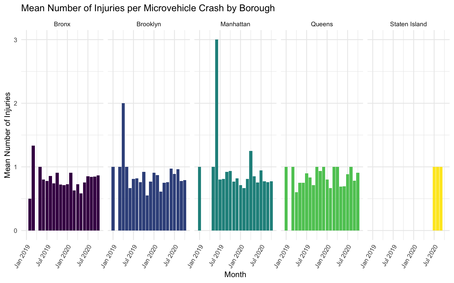
micro_num %>%
  mutate(date = as.yearmon(paste(year, month, sep = "-"))) %>%
  ggplot(aes(x = date, y = number_of_crashes, fill = borough)) +
  geom_bar(stat = "identity", show.legend = FALSE) +
  labs(
    title = "Number of Crashes by Borough",
    x = "Month",
    y = "Number of Crashes"
  ) +
  theme(legend.position="right", legend.title = element_blank(),
        text = element_text(size = 10),
        axis.text.x = element_text(angle = 60, hjust = 1, size = 8)) +
  facet_grid(. ~ borough)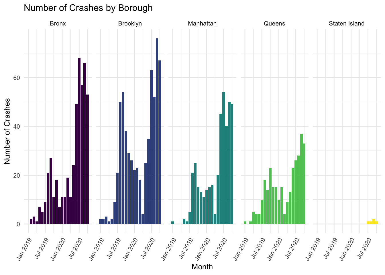
It is apparent that there are very low numbers of microvehicle crashes when stratifying by both month and borough - sometimes as low as only 1 crash, or even 0 crashes (particularly in Staten Island).
Below, I extract the rate ratio estimates for the microvehicle data by borough.
fit_injuries_micro = crash_dat_tidy %>%
  filter_for("micro") %>%
  filter(year %in% c(2019, 2020)) %>%
  mutate(borough = str_to_title(borough)) %>%
  group_by(year) %>%
  mutate(year_2020 = year - 2019) %>%
  nest(data = -month) %>%
  mutate(models = map(data, ~glm(number_of_persons_injured ~ year_2020:borough,
                                 family = "poisson", data = .x)),
         models = map(models, broom::tidy)) %>%
  select(-data) %>%
  unnest(models) %>%
  select(month, term, estimate, std.error, p.value) %>%
  mutate(term = str_replace(term, "year_2020:borough", "2020 v. 2019, Borough: ")) %>%
  left_join(month_df, by = "month") %>%
  select(-month) %>%
  rename(month = month_name) %>%
  select(month, everything())

fit_injuries_micro %>%
  filter(term != "(Intercept)" & month != "November" & month != "December" & p.value < .05) %>%
knitr::kable(digits = 2)| month | term | estimate | std.error | p.value |
|---|
Here, I extract my coefficient of interest, which is the difference in injury rate in microvehicle crashes occurring in 2020 v. occurring in 2019. I plot estimates for each borough within each month, making sure to exponentiate these estimates. I include a horizontal line at Y = 1 to indicate the null value.
fit_injuries_micro %>%
  filter(term != "(Intercept)" & month != "November" & month != "December") %>%
  mutate(term = str_replace(term, "2020 v. 2019, ", "")) %>%
  ggplot(aes(x = month, y = exp(estimate), color = term)) +
  geom_point(show.legend = FALSE, aes(size = estimate, alpha = .7)) +
  geom_errorbar(aes(ymin = exp(estimate - (1.96*std.error)),
                    ymax = exp(estimate + (1.96*std.error)))) +
  geom_hline(yintercept = 1, linetype="dashed",
                color = "darkred", size = 1, alpha = .7) +
  labs(
    title = "Difference in Rate of Injuries Per Crash Involving a Microvehicle in 2020 v. 2019",
    x = "Month",
    y = "2020 v. 2019 Difference"
  ) +
  ylim(0, 5) +
  theme(legend.position="right", legend.title = element_blank(),
        text = element_text(size = 10),
        axis.text.x = element_text(angle = 60, hjust = 1, size = 8)) +
  facet_grid(. ~ term)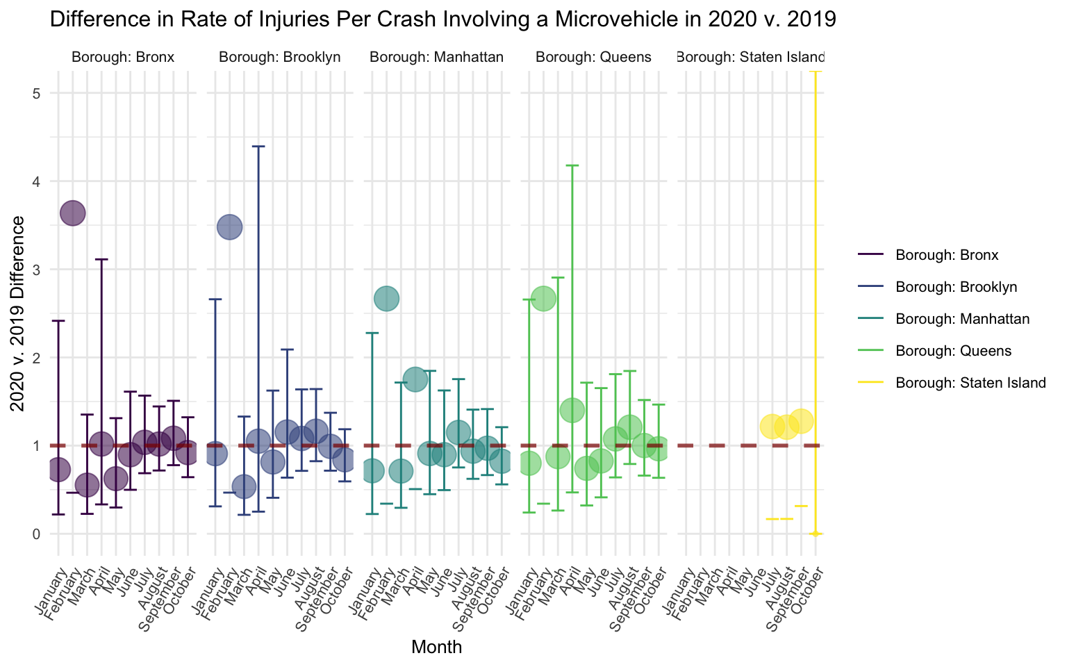
There is no discernable pattern in the figure, suggesting that rates of injury per microvehicle crash did not differ between 2020 and 2019. In part, this could be due to very wide confidence intervals.
Bikes
Again, I first tested to see if there was an overall association of 2020 v. 2019 with number of injuries in bike crashes (as in the microvehicle data).
fit_injuries_bike_all = crash_dat_tidy %>%
  filter_for("bike") %>%
  filter(year %in% c(2019, 2020)) %>%
  group_by(year) %>%
  mutate(year_2020 = year - 2019) %>%
  nest(data = -month) %>%
  mutate(models = map(data, ~glm(number_of_persons_injured ~ year_2020,
                                 family = "poisson", data = .x)),
         models = map(models, broom::tidy)) %>%
  select(-data) %>%
  unnest(models) %>%
  select(month, term, estimate, std.error, p.value) %>%
  mutate(term = str_replace(term, "year_2020", "2020 v. 2019")) %>%
  left_join(month_df, by = "month") %>%
  select(-month) %>%
  rename(month = month_name) %>%
  filter(term != "(Intercept)" & month != "November" & month != "December") %>%
  select(month, everything())

fit_injuries_bike_all %>% knitr::kable(digits = 2)| month | term | estimate | std.error | p.value |
|---|---|---|---|---|
| January | 2020 v. 2019 | 0.01 | 0.09 | 0.89 |
| February | 2020 v. 2019 | 0.03 | 0.10 | 0.78 |
| March | 2020 v. 2019 | 0.13 | 0.09 | 0.13 |
| April | 2020 v. 2019 | 0.01 | 0.10 | 0.96 |
| May | 2020 v. 2019 | 0.01 | 0.07 | 0.90 |
| June | 2020 v. 2019 | 0.02 | 0.06 | 0.69 |
| July | 2020 v. 2019 | 0.05 | 0.06 | 0.35 |
| August | 2020 v. 2019 | 0.04 | 0.06 | 0.51 |
| September | 2020 v. 2019 | 0.04 | 0.06 | 0.47 |
| October | 2020 v. 2019 | 0.08 | 0.07 | 0.24 |
Although there was no statistically significant evidence for a different rate of injury in 2020 v. 21 in any month, I proceeded to examine this stratified by borough.
I also wanted to get descriptives for number of bike crashes and injuries in each borough in each month.
bike_num = crash_dat_tidy %>%
  filter_for("bike") %>%
  filter(year %in% c(2019, 2020)) %>%
  group_by(year, month, borough) %>%
  summarise(number_of_crashes = n(),
            mean_number_of_injuries = mean(number_of_persons_injured)) %>%
  drop_na(borough) %>%
  left_join(month_df, by = "month") %>%
  as.tibble() %>%
  mutate(borough = str_to_title(borough))

bike_num %>%
  select(year, month_name, borough, number_of_crashes,
         mean_number_of_injuries) %>%
head() %>% knitr::kable(digits = 2)| year | month_name | borough | number_of_crashes | mean_number_of_injuries |
|---|---|---|---|---|
| 2019 | January | Bronx | 17 | 0.76 |
| 2019 | January | Brooklyn | 74 | 0.85 |
| 2019 | January | Manhattan | 67 | 0.76 |
| 2019 | January | Queens | 41 | 0.88 |
| 2019 | January | Staten Island | 1 | 0.00 |
| 2019 | February | Bronx | 18 | 0.83 |
bike_num %>%
  mutate(date = as.yearmon(paste(year, month, sep = "-"))) %>%
  ggplot(aes(x = date, y = mean_number_of_injuries, fill = borough)) +
  geom_bar(stat = "identity", show.legend = FALSE) +
  labs(
    title = "Mean Number of Injuries per Bike Crash by Borough",
    x = "Month",
    y = "Mean Number of Injuries"
  ) +
  theme(legend.position="right", legend.title = element_blank(),
        text = element_text(size = 10),
        axis.text.x = element_text(angle = 60, hjust = 1, size = 8)) +
  facet_grid(. ~ borough)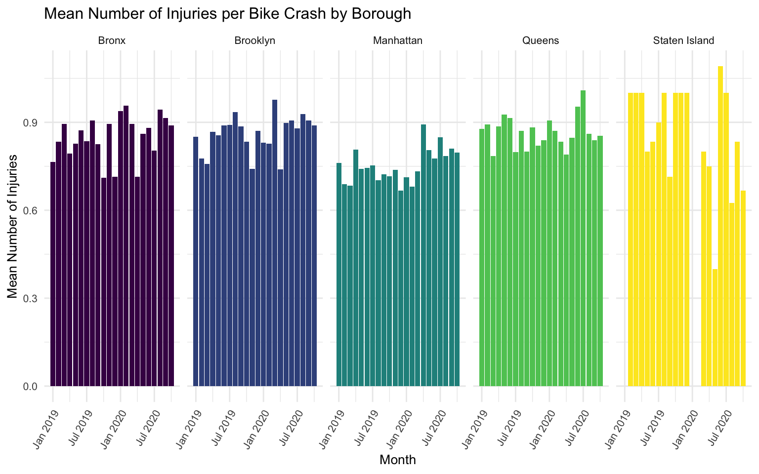
bike_num %>%
  mutate(date = as.yearmon(paste(year, month, sep = "-"))) %>%
  ggplot(aes(x = date, y = number_of_crashes, fill = borough)) +
  geom_bar(stat = "identity", show.legend = FALSE) +
  labs(
    title = "Number of Bike Crashes by Borough",
    x = "Month",
    y = "Number of Crashes"
  ) +
  theme(legend.position="right", legend.title = element_blank(),
        text = element_text(size = 10),
        axis.text.x = element_text(angle = 60, hjust = 1, size = 8)) +
  facet_grid(. ~ borough)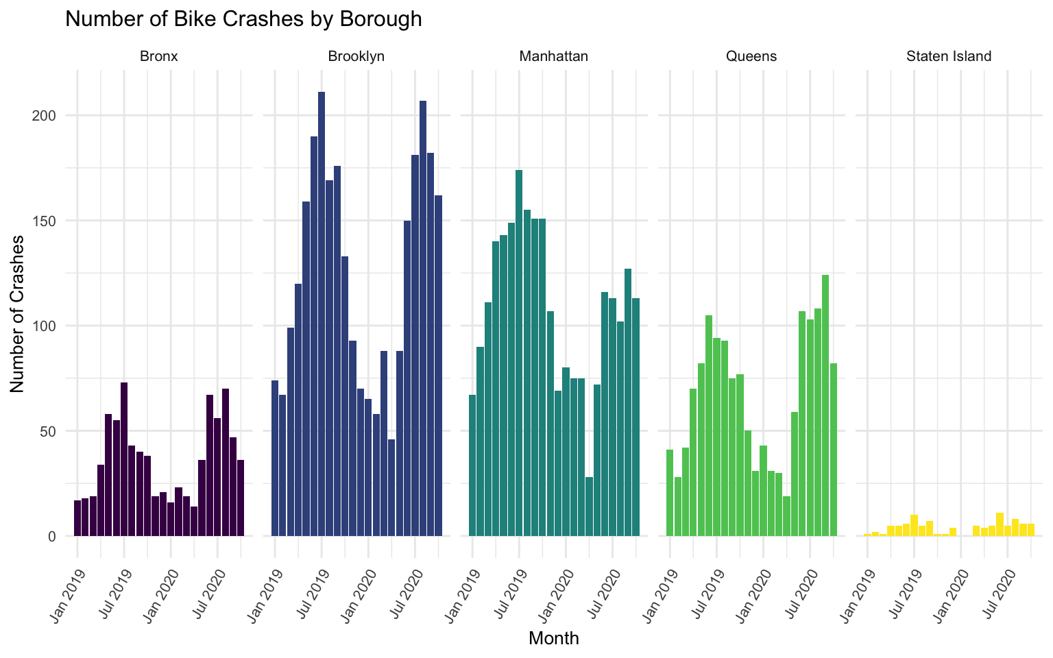
It is again apparent that there are very low numbers of crashes when stratifying by both month and borough.
Below, I extract the rate ratio estimates for the bike data by borough (as in the microvehicle data).
fit_injuries_bike = crash_dat_tidy %>%
  filter_for("bike") %>%
  mutate(borough = str_to_title(borough)) %>%
  filter(year %in% c(2019, 2020)) %>%
  group_by(year) %>%
  mutate(year_2020 = year - 2019) %>%
  nest(data = -month) %>%
  mutate(models = map(data, ~glm(number_of_persons_injured ~ year_2020:borough,
                                 family = "poisson", data = .x)),
         models = map(models, broom::tidy)) %>%
  select(-data) %>%
  unnest(models) %>%
  select(month, term, estimate, std.error, p.value) %>%
  mutate(term = str_replace(term, "year_2020:borough", "2020 v. 2019, Borough: ")) %>%
  left_join(month_df, by = "month") %>%
  select(-month) %>%
  rename(month = month_name) %>%
  select(month, everything())

fit_injuries_bike %>%
  filter(term != "(Intercept)" & month != "November" & month != "December" & p.value < .05) %>%
knitr::kable(digits = 2)| month | term | estimate | std.error | p.value |
|---|---|---|---|---|
| March | 2020 v. 2019, Borough: Brooklyn | 0.27 | 0.13 | 0.03 |
Below, I plot the estimates for the bike data (as in the microvehicle data).
fit_injuries_bike %>%
  filter(term != "(Intercept)" & month != "November" & month != "December") %>%
  mutate(term = str_replace(term, "2020 v. 2019, ", "")) %>%
  ggplot(aes(x = month, y = exp(estimate), color = term)) +
  geom_point(show.legend = FALSE, aes(size = estimate, alpha = .7)) +
  geom_errorbar(aes(ymin = exp(estimate - (1.96*std.error)),
                    ymax = exp(estimate + (1.96*std.error)))) +
  geom_hline(yintercept = 1, linetype="dashed",
                color = "darkred", size = 1, alpha = .7) +
  labs(
    title = "Difference in Rate of Injuries Per Crash Involving a Bike in 2020 v. 2019",
    x = "Month",
    y = "2020 v. 2019 Difference"
  ) +
  ylim(0, 5) +
  theme(legend.position="right", legend.title = element_blank(),
        text = element_text(size = 10),
        axis.text.x = element_text(angle = 60, hjust = 1, size = 8)) +
  facet_grid(. ~ term)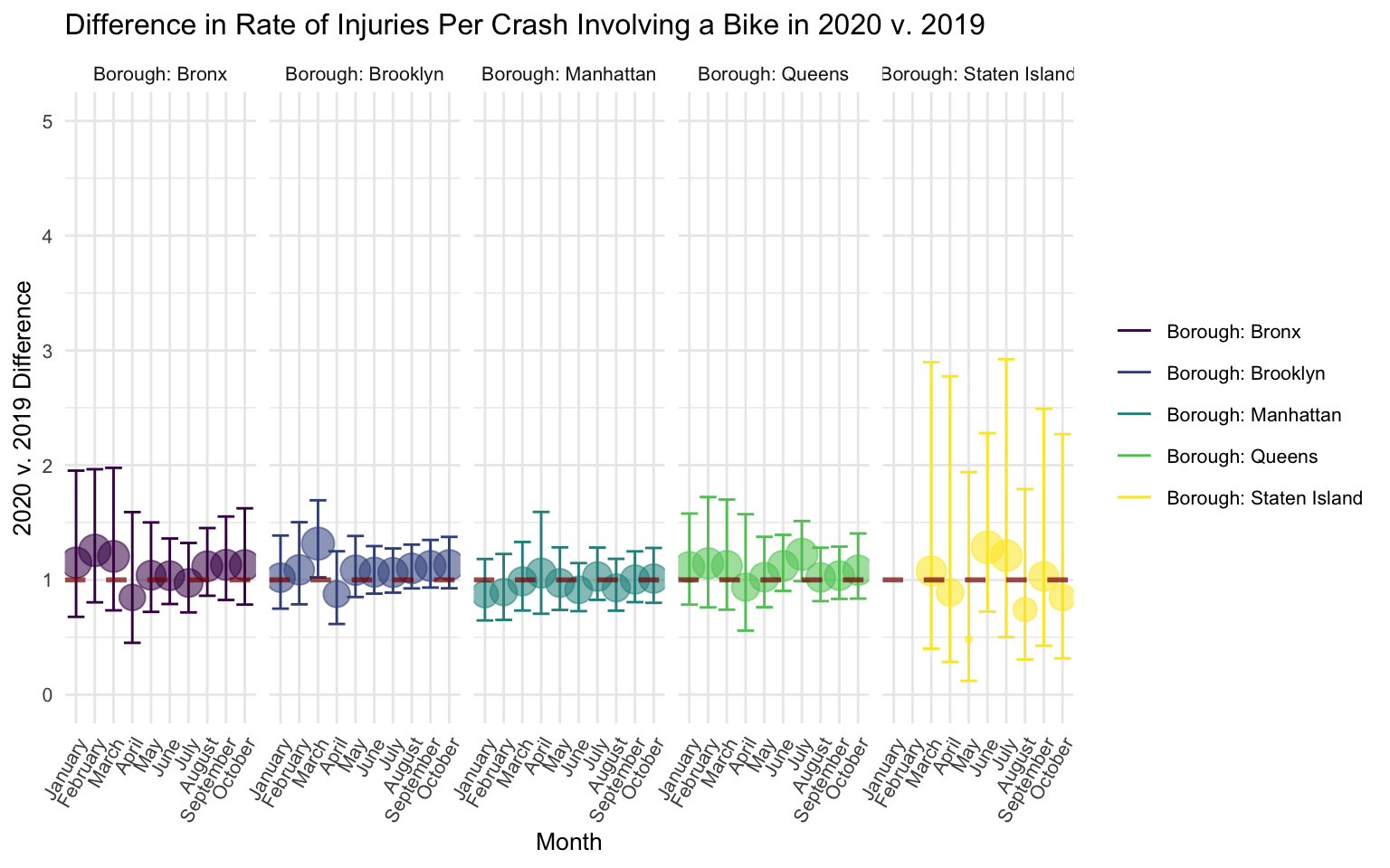
There is no discernable pattern in the figure, suggesting that rates of injury per bike crash did not differ between 2020 and 2019.
Summary
In sum, there was no evidence that rates of injuries per crash differed between 2020 and 2019 for crashes that involved either microvehicles or bikes.